
LIVE DATA DASHBOARD DEVELOPMENT: ARCHITECTURE AND BEST PRACTICES
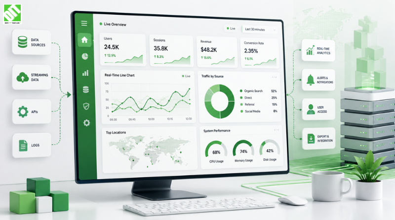
Build live data dashboards with proper architecture. Learn scalable design, real-time processing, and best practices enabling instant business insights.
Live data dashboards have become essential tools for modern businesses. Organizations that can visualize and act on data in real-time gain significant competitive advantage over those relying on delayed reporting. A live data dashboard transforms raw data streams into actionable insights that drive immediate decision-making. Yet building effective dashboards requires careful planning, proper architecture and understanding technical complexities.
The difference between a poorly built dashboard and an excellent one often determines whether organizations can respond to market changes, detect problems early or capitalize on opportunities. Poor dashboards waste time by presenting irrelevant data or overwhelming users with information. Excellent dashboards surface critical insights instantly, guide users to what matters most and enable confident decision-making. The path to excellence begins with understanding what makes dashboards powerful and how to architect them properly.
This comprehensive guide walks you through live data dashboard development. What dashboards accomplish. Why they matter for business success. Architecture patterns that work. Technology choices that enable scalability. Design principles that enhance usability. Real-world implementation examples. Performance optimization techniques. Security considerations that protect sensitive data. By the end, you'll understand exactly how to design, develop and deploy live data dashboards that deliver measurable business value.
Key Takeaways
Live data dashboards provide real-time visibility into business metrics, enabling faster decision-making and competitive advantage.
Successful dashboard development requires proper architecture supporting data ingestion, processing, storage and visualization layers working together seamlessly.
Scalable dashboards handle increasing data volume and user load through distributed systems, caching strategies and optimized queries.
User experience design directly impacts dashboard effectiveness—dashboards that guide users to insights outperform those overwhelming them with data.
Real-time data pipeline architecture must balance latency, throughput and accuracy to deliver insights when they matter most.
Cloud-based dashboard architectures offer scalability, flexibility and cost efficiency that on-premise solutions cannot match.
Live data dashboards fail most often due to poor data quality, inadequate architecture supporting growth or misalignment with actual user needs.
Effective dashboards combine technical excellence with thoughtful design, presenting complex data in instantly understandable visualizations.
Dashboard security requires implementing proper authentication, authorization, encryption and data governance throughout the entire stack.
Successful dashboards are living systems that evolve based on user feedback and changing business requirements.
What Is a Live Data Dashboard?
Understanding Dashboard Fundamentals
A live data dashboard is a visual interface displaying real-time or near-real-time data from multiple sources in organized, interactive visualizations. Unlike traditional reports updated daily or weekly, live dashboards update continuously as new data arrives. Users see current metrics, trends and patterns instead of historical snapshots. This immediacy enables responding to events as they happen rather than discovering issues after the fact.
Live dashboards serve multiple purposes across organizations. Executives monitor key performance indicators tracking business health. Operations teams watch system metrics ensuring infrastructure stability. Sales teams track real-time pipeline activity and closed deals. Customer service teams monitor ticket volumes and resolution times. Analytics teams explore data patterns discovering insights. Each use case has different requirements but all share the need to access current data instantly.
Key Components of Live Data Dashboards
Effective dashboards include several interconnected components. Data sources provide raw information from various systems—databases, APIs, message queues, sensors. Data ingestion pipelines collect data from sources and move it into processing systems. Data processing transforms raw data into metrics and aggregations relevant to business questions. Storage systems hold data efficiently for retrieval. Visualization layers render data as charts, tables, gauges and other visual elements users can interpret quickly. Interactive features enable users to filter, drill-down and explore data deeper.
All components must work together smoothly. Poor data ingestion creates stale dashboards. Inefficient processing creates lag users perceive as unresponsiveness. Inadequate storage causes performance problems at scale. Poor visualization design causes users to misinterpret data. Missing interactivity forces users to create custom reports for analysis. Excellence requires getting all components right simultaneously.
Why Live Data Dashboards Matter
Real-time visibility changes how organizations operate. Problems detected immediately can be resolved before customers notice impact. Opportunities spotted quickly can be capitalized before competitors react. Performance trends visible instantly enable course correction before problems become severe. This advantage compounds over time—organizations that see and respond faster win more business, retain more customers and innovate faster.
Beyond competitive advantage, dashboards improve operational efficiency. Instead of gathering data across multiple systems, dashboards centralize visibility. Teams spend less time collecting information and more time analyzing it. Decision-making speeds up. Meetings become more productive when participants have current data. Accountability improves when performance becomes transparent. These efficiency gains justify dashboard investment quickly.
Live Data Architecture Patterns
The Data Ingestion Layer
Building scalable dashboards begins with robust data ingestion. Data comes from many sources with different characteristics—high-frequency sensor data, database transactions, API calls, streaming events. Ingestion systems must handle diverse source types while maintaining data quality and minimizing latency. Many organizations work with custom software development teams to build ingestion systems tailored to their specific data sources and requirements.
Effective ingestion uses message queues as buffers. Sources publish data to queues. Processing systems consume from queues at their own pace. This decoupling prevents one slow consumer from blocking others and enables scaling consumers independently. Message systems like Apache Kafka or cloud-native alternatives provide this buffering while enabling replay of historical data for recovery or reanalysis.
Ingestion systems must handle failures gracefully. Networks fail. Sources temporarily go offline. Processing systems crash. Robust architectures implement retry logic, dead-letter queues for problematic data and monitoring alerting when data flow stops. Some data loss is often acceptable but dashboards should gracefully degrade when data becomes unavailable rather than breaking completely.
Data Processing and Transformation
Raw data rarely answers business questions directly. Processing transforms raw data into metrics relevant to dashboards. A dashboard showing "customer acquisition" requires processing raw events into counts grouped by day, channel and region. Building efficient processing requires understanding your specific metrics and designing processing accordingly.
Stream processing handles continuous data flowing at high volume. Systems like Apache Flink, Spark Streaming or cloud-native services enable defining transformations running continuously. Window-based aggregations calculate metrics over time periods—sum transactions per minute, average response times per hour. State management tracks running computations. Exactly-once semantics ensure metrics stay consistent. Getting stream processing right significantly impacts dashboard responsiveness and accuracy.
Batch processing handles historical data and complex transformations. Batch systems reprocess entire datasets generating metrics used in dashboards. Scheduled jobs running nightly update dashboards with complete daily summaries. Batch systems often generate data for slower-changing dashboard sections while stream processing powers real-time metrics. Combining both approaches handles dashboards efficiently.
Storage Architecture for Dashboards
Dashboards need extremely fast data access. A dashboard loading in five seconds feels slow and sluggish. Dashboards that load in under one second feel responsive. Supporting responsive queries requires careful storage architecture. Time-series databases excel at storing metrics over time—perfect for dashboards showing trends. Document databases enable flexible schema supporting diverse dashboard types. Column-oriented databases enable fast aggregations over large datasets. Most sophisticated dashboards use multiple storage systems optimized for different access patterns.
Caching dramatically improves dashboard performance. Pre-computed results cached in-memory enable serving dashboards instantly. Cache invalidation becomes critical—serving stale data erodes trust but recomputing everything eliminates caching benefits. Intelligent cache strategies compute results on schedules aligned with data freshness requirements. Some results update every second. Others update every hour. Matching cache strategy to business requirements optimizes performance and cost.
Data warehouses enable analytics on large historical datasets. Dashboards can query warehouses for trend analysis but serving real-time dashboards from warehouses causes latency. Modern architectures use data lakes or lakehouses providing warehouse analytics capability with better performance characteristics for dashboards. Cloud integration services help organizations build storage architectures moving data from sources through processing to dashboards efficiently.
Visualization and Interaction Layer
Dashboard frontend code renders data as visualizations users can understand instantly. Modern web frameworks like React, Vue or Angular enable building responsive interfaces. Visualization libraries like D3, Chart.js or Plotly render data as charts. Good visualization design makes patterns obvious—a chart showing downward trend communicates instantly what paragraphs of text would explain. Poor visualization design hides insights in confusing displays.
Interactive features enable users to explore deeper. Filters narrow focus to relevant data. Drill-down enables examining summary metrics by looking at detail components. Range selectors enable comparing time periods. Hover tooltips show exact values. Well-designed interactivity guides users toward insights without overwhelming them. Overloading dashboards with options creates confusion. Strategic interactivity helps users answer specific questions.
Real-time updates present technical and UX challenges. Updating entire dashboards continuously causes flickering and disorientation. Smart updates only refresh components that actually changed. Smooth animations ease visual transitions when data changes. Users should notice updates without finding them distracting. Mobile dashboards require different designs than desktop versions—smaller screens demand ruthless prioritization. API development services build robust APIs feeding dashboards with updated data efficiently.
Designing Effective Live Data Dashboards
Understanding Your Users and Use Cases
Dashboard effectiveness begins before touching code. Understanding who uses dashboards and what questions they need answered drives every design decision. Executives need different information than operations teams. Sales managers need different views than individual contributors. Dashboards designed for executives but used by analysts create frustration.
User interviews reveal how people actually work. Many dashboards are built based on assumptions rather than user needs. Assumptions often prove wrong. Actual users might never look at carefully designed sections while struggling with unintuitive areas. Interviews prevent wasting effort on unused features while revealing real pain points. Observing users working with early prototypes reveals confusion points missed by interviews alone.
Different users need different dashboards. A single dashboard attempting to serve everyone often serves no one well. Role-based dashboards customized for different user types enable each group to see what matters. Templates for common roles enable quickly creating new dashboards. Customization options enable individual tweaking without requiring rebuilding. Layered complexity—showing summaries by default with detail available via drill-down—serves multiple skill levels.
Key Metrics and KPIs
Dashboards should surface key business metrics. Every organization has critical metrics determining success—revenue, customer satisfaction, operational cost, growth rate. These metrics deserve dashboard prominence. Too many metrics overwhelm. Too few miss important information. Finding the right balance requires understanding business strategy. Dashboards should make strategy visible—if your strategy is customer retention, retention metrics should dominate dashboards.
Metrics should include targets and thresholds. Showing revenue is useful. Showing revenue versus target is more useful—it clarifies whether current performance matches goals. Color coding thresholds enables spotting problems instantly—red for below-target performance, green for above-target. Historical context matters—showing today's value versus yesterday, last week and last year provides perspective. Trends reveal whether situations are improving or deteriorating.
Vanity metrics look good but don't drive good decisions. Page views and social mentions feel important but often don't correlate with business success. Real metrics connect to business outcomes—customer acquisition cost, customer lifetime value, conversion rates, retention rates. Real metrics sometimes show unflattering trends but enable real improvement.
Visual Design Principles
Simplicity enables understanding. Dashboards with excessive color, animation and decorative elements distract from data. The best dashboards feel clean and focused. Every visual element should serve a purpose. Charts should be large enough to see clearly. Text should be minimal and direct. Whitespace helps users focus attention.
Color serves function, not just aesthetics. Color-blind users struggle with red-green color schemes. Consistent color meaning across dashboards prevents confusion—green always means good, red always means bad. Gradients enable showing ranges. Avoiding excessive color combinations maintains clarity. Modern design emphasizes accessibility from the start.
Chart type selection impacts understanding. Line charts show trends over time effectively. Bar charts compare values across categories. Pie charts often confuse rather than clarify—humans judge areas poorly. Heat maps show patterns in two-dimensional data. Gauge charts show current values against ranges. Choosing appropriate chart types makes patterns obvious.
Building Scalable Dashboard Systems
Handling Growing Data Volume
As dashboards become more valuable, data volume increases. Systems handling megabytes daily might need handling gigabytes weekly. Dashboards that respond instantly might slow noticeably as data grows. Designing for scale from the start prevents painful rewrites later.
Partitioning data enables managing large datasets. Databases partition data by time—queries usually access recent data, not historical data. Storage tiering moves older data to cheaper storage. Archives hold very old data rarely accessed but kept for compliance. Strategic partitioning enables keeping recent data in fast storage while managing total storage cost.
Aggregation reduces data volume while preserving insights. Raw data might contain millions of events daily. Pre-aggregating to hourly summaries reduces dataset size dramatically while enabling most dashboards. This works because most dashboards examine trends and summaries, not individual events. Events used for detailed analysis can be archived separately.
Sampling provides insights from very large datasets. When collecting every event is infeasible, representative sampling provides accurate statistics. Systematic sampling—collecting every nth event—ensures representativeness. Stratified sampling—ensuring sample includes proportional amounts of each category—improves accuracy. Sampling enables maintaining dashboards on datasets otherwise unmanageable.
Auto-Scaling and Load Management
Cloud infrastructure enables scaling infrastructure based on demand. When dashboard traffic spikes, additional servers activate automatically. When traffic drops, unnecessary servers shut down. This elasticity enables handling unpredictable traffic efficiently without maintaining capacity for peak load constantly.
Load balancing distributes user requests across multiple servers. No single server becomes bottleneck. Load balancers monitor server health, automatically removing failed servers from rotation. Connection pooling enables handling more concurrent users with fewer server resources. Efficient resource management lets small teams handle massive dashboards.
Rate limiting protects dashboards from overload. When query volume exceeds system capacity, rate limiting queues excess queries rather than letting them consume all resources. Fair queuing ensures all users get reasonable response times rather than some users getting responses while others wait indefinitely. Query prioritization enables important queries completing quickly while batch analysis waits.
Monitoring and Observability
Dashboards depend on underlying systems. When data ingestion fails, dashboards show stale data. When processing lags, dashboards fall behind real-time. When storage has issues, dashboards respond slowly or fail. Understanding system health requires comprehensive monitoring.
Metrics monitoring tracks system performance—data ingestion rate, processing latency, query response times, storage utilization. Alerting notifies teams when metrics exceed thresholds indicating problems. Log analysis enables diagnosing issues when problems occur. Distributed tracing follows requests through the entire system showing where delays occur.
Health checks validate data freshness. Dashboards should alert when data becomes older than expected. If customer data should update every minute but hasn't updated in five minutes, that's a problem requiring investigation. Automated health checks catch problems before users notice, enabling proactive fixes.
Implementation Examples
E-Commerce Real-Time Analytics
An e-commerce company built a live dashboard monitoring order processing. Real-time metrics show orders received, orders shipped, orders cancelled and processing time. During holiday shopping surge, dashboard revealed bottleneck in payment processing. Team addressed issue immediately, preventing revenue loss from abandoned orders. The dashboard-enabled visibility paid for itself in hours.
Architecture included order events streaming from order system to message queue. Stream processors aggregated orders by status and time window. Results stored in time-series database. Frontend pulled updates every second. Dashboard visualized data with line charts showing throughput and pie charts showing order distribution by status.
Infrastructure Monitoring Dashboard
An operations team deployed live dashboard monitoring application infrastructure. Metrics included CPU utilization, memory usage, network traffic, error rates and request latencies. Dashboard color-coded servers red when experiencing issues, yellow when trending wrong directions, green when healthy. When traffic spike caused problems, dashboard immediately highlighted affected servers enabling targeted response.
Architecture ingested metrics from application servers and load balancers. Processing aggregated metrics by minute. Storage kept last hour of detailed data and longer history of hourly summaries. Frontend displayed metrics with heat maps for quick pattern spotting. Real-time alerts notified on-call engineers of problems.
Finance Performance Dashboard
A financial services company built dashboard tracking portfolio performance. Metrics included asset prices, portfolio values, performance versus benchmarks and risk metrics. Traders accessed dashboard on large monitors displaying market movements. Dashboard enabled spotting arbitrage opportunities enabling profitable trades. When market conditions shifted, dashboard visualizations revealed new strategies to explore.
Architecture handled high-frequency price data ingesting thousands of updates per second. Stream processing calculated portfolio metrics continuously. Results stored in fast in-memory database enabling instant queries. Dashboard updated every second. Complex calculations for risk metrics ran both in real-time and batch, combining both approaches efficiently.
Live Data Dashboard Best Practices
Prioritize Data Quality
Dashboards are only as good as underlying data. Garbage in equals garbage out. Implementing data quality checks catches problems early. Validation ensures data conforms to expected formats and ranges. Anomaly detection spots unexpected patterns indicating data problems. Dead letter queues capture problematic data for investigation.
Data lineage tracking shows where data originates and how it transforms. When dashboard values seem wrong, lineage enables tracing through processing steps finding source. Documentation of transformations helps new team members understand data meaning. Well-managed data quality enables confident decision-making.
Design for Performance
Dashboard performance directly impacts adoption. Slow dashboards frustrate users who eventually stop using them. Fast dashboards become indispensable tools. Performance requires attention at every layer.
Query optimization prevents database from becoming bottleneck. Proper indexing enables finding data quickly. Query analysis reveals expensive queries enabling targeted optimization. Materialized views pre-compute expensive joins. Statistics-based optimization adapts queries to data distribution.
Frontend optimization reduces load time and interaction latency. Code splitting loads only necessary code initially. Lazy loading postpones non-critical content. Compression reduces data transfer. Efficient rendering prevents unnecessary redraws. Performance monitoring identifies where time is actually spent.
Implement Strong Security
Dashboards often display sensitive business data. Unauthorized access creates security vulnerability. Authentication ensures only authorized users access dashboards. Role-based access control limits users to data appropriate for their role. Encryption protects data in transit and at rest.
Audit logging tracks who accessed what data when. This accountability deters misuse and enables investigating incidents. Data masking hides sensitive values like social security numbers or credit cards in dashboards shown to support staff. Encryption of sensitive fields prevents unauthorized access even if database is compromised.
Build Feedback Mechanisms
Dashboards are never finished. User feedback reveals improvements. Ratings enable identifying which dashboards provide value. Comments enable users explaining why dashboards help or hinder. Analytics on dashboard usage reveal which sections get attention and which remain ignored.
Regular review sessions with users maintain alignment. Business needs change. Competitive landscape shifts. Dashboards should evolve with business. Scheduled updates prevent dashboards from becoming stale. Deprecated metrics should be removed. New metrics should be added as they become important.
Documentation and Training
Well-documented dashboards are more useful. Metric definitions prevent confusion. Explanation of calculation methods ensures users understand limitations. Use case examples show how different user types leverage dashboards. Video tutorials accelerate adoption.
Training programs enable users to use dashboards effectively. Hands-on sessions teach specific dashboards. Online resources enable self-service learning. Power user training creates champions who help peers. Feedback from training reveals common confusion points enabling improvement.
Common Live Data Dashboard Challenges
Data Latency
Users expect real-time updates. Delivering truly real-time data at scale is technically challenging. Every layer introduces latency—data collection, transmission, ingestion, processing, storage access, visualization. Latency accumulates through layers. Systems optimized for one millisecond latency still deliver one hundred millisecond end-to-end latency across all layers.
Solution: Accept appropriate latency levels for your use case. High-frequency trading needs millisecond latency. Daily reports can tolerate hour latency. Accept tradeoffs—lower latency costs more. Understanding actual requirements prevents over-building. Monitor end-to-end latency ensuring it matches expectations.
Scalability Issues
Dashboards that work wonderfully with millions of rows sometimes collapse with billions. Dashboards responsive with hundreds of users might timeout with thousands. Scalability requires rethinking architecture when volume grows. Premature optimization wastes effort. Too-late optimization requires emergency fixes.
Solution: Load test early and often. Identify scalability limits before deployment. Build scalable architecture from start—it costs less than retrofitting. Use caching, partitioning and aggregation strategically. Cloud elasticity enables handling growth without overprovisioning. Monitor growth metrics predicting when scaling becomes necessary.
Integration Complexity
Dashboards typically pull from multiple data sources. Integrating diverse sources proves more complex than expected. APIs change. Data formats vary. Latency differs. One slow source might block others. Synchronizing data from multiple sources requires careful coordination.
Solution: Build integration layers abstracting source differences. Standardize data formats early in pipeline. Decouple sources enabling handling source changes without affecting dashboards. Implement timeout strategies preventing slow sources from blocking fast ones. Consider dedicated integration tools simplifying source connectivity.
User Adoption
Building dashboards doesn't guarantee use. Some carefully built dashboards collect dust while others become essential tools. Understanding why separates successful dashboards from failures. Dashboards not aligned with user needs get ignored. Dashboards that are hard to find don't get used. Dashboards that don't answer real questions provide no value.
Solution: Involve users in design. Pilot with key users before full rollout. Marketing your dashboards through example use cases drives adoption. Training removes barriers to use. Integrating dashboards into standard processes ensures exposure. Regular maintenance keeps dashboards current. Listening to user feedback drives continuous improvement.
Conclusion
Live data dashboards have become business-critical tools for organizations competing in real-time markets. Organizations that see and respond to information faster gain advantage. Dashboards enabling instant insight into critical metrics drive better decisions. Yet effective dashboards require more than attractive visualizations. Proper architecture supporting data volume, responsive processing and reliable performance remain essential.
Building excellent dashboards requires understanding your users, designing thoughtful visualizations, implementing scalable architecture and maintaining rigorous data quality. It requires balancing technical excellence with user-centric design. Technology enables dashboards but thoughtful application of technology creates dashboards that deliver value. Most importantly, dashboards should be living systems that evolve with your business.
Starting with clear business questions guides architecture decisions. Understanding your data enables designing appropriate pipelines. Considering scale from the start prevents painful rewrites. Involving users throughout development ensures relevance. Testing thoroughly before deployment prevents embarrassing failures. Maintaining dashboards based on feedback keeps them valuable. These practices separate dashboards that drive business decisions from those gathering virtual dust.
Real-time visibility into business metrics matters more than ever. Markets move fast. Data volumes grow. Competitive pressures increase. Organizations leveraging live data dashboards effectively gain advantage. Those slowly analyzing yesterday's data fall behind. Building dashboards that deliver insights when they matter most requires technical skill, user understanding and architectural sophistication. The effort invested pays substantial dividends through better decisions, faster response and competitive advantage.
To understand why your organization needs real-time data capabilities, explore Why Businesses Need Real-Time Data Integration to discover how real-time data becomes competitive advantage. This deeper analysis explains the business drivers making live dashboards essential in modern environments. Begin your dashboard journey today. Identify your most critical business questions. Design dashboards answering those questions. Deploy incrementally learning and improving. Your competitive advantage depends on acting on data faster than competitors. Dashboards enable exactly that capability.
Frequently Asked Questions
What is the difference between a live dashboard and a traditional report?
Live dashboards display data updated in real-time or near-real-time as new data arrives, enabling immediate visibility and response. Traditional reports are static documents generated on schedules—daily, weekly or monthly—showing historical data. Live dashboards excel at monitoring current conditions and spotting changes immediately. Reports work well for analysis of historical trends and detailed documentation. Most organizations use both—dashboards for real-time monitoring, reports for historical analysis and compliance documentation.
How often should live data dashboard data update?
Update frequency depends on your use case and business requirements. High-frequency trading dashboards update every millisecond. Operations dashboards often update every second or minute. Sales dashboards might update every five to fifteen minutes. Analytics dashboards might update hourly or daily. More frequent updates cost more in infrastructure and complexity. Determine appropriate freshness based on how you'll use data, not on maximum technical capability.
What technologies should we use to build live dashboards?
No single technology stack fits all situations. Message queues like Kafka handle data ingestion. Stream processors like Flink or Spark handle real-time processing. Databases like Postgres, Elasticsearch or InfluxDB store data. Frontend frameworks like React render dashboards. Cloud providers like AWS, Azure or Google Cloud provide managed services. Successful dashboards combine technologies chosen based on specific requirements, not arbitrary preferences.
How do we ensure dashboard data accuracy?
Data accuracy requires attention throughout the pipeline. Validate data at ingestion catching bad data early. Implement processing logic carefully—mistakes in aggregation calculations compound across dashboards. Store data redundantly enabling verification. Implement audit trails tracking changes. Use reference datasets validating results. Monitor for anomalies suggesting data problems. Test thoroughly before deployment. Establish data quality processes preventing problems rather than just detecting them.
What metrics should we include in dashboards?
Include metrics connected to business strategy and outcomes. Avoid vanity metrics looking impressive but not actionable. Good metrics enable answering specific business questions. Include both current values and context—values relative to targets, trends over time, comparisons to previous periods. Limit metrics to what users will actually review—too many metrics overwhelm. Prioritize ruthlessly, showing most important information prominently. Different user types need different metrics.
How do we handle dashboard performance when data volume grows?
Scalability requires strategic architecture choices. Partition data enabling efficient queries on subsets. Aggregate data reducing detail requirements. Cache pre-computed results serving instant queries. Use time-series databases optimized for streaming data. Implement query optimization eliminating expensive operations. Store older data in cheaper, slower storage. Test load growth scenarios predicting when scaling becomes necessary. Design for cloud elasticity enabling automatic scaling.
Can we build live dashboards on limited budget?
Yes, though tradeoffs exist. Open-source technologies like Kafka, Elasticsearch and Grafana reduce licensing costs. Cloud services enable paying for usage rather than maintaining infrastructure. Starting simple—fewer metrics, fewer data sources—enables learning before scaling. Incrementally adding complexity prevents over-building. Hosting dashboards in cloud provides elasticity without upfront infrastructure investment. Starting small enables building expertise before tackling complexity.
How do we ensure dashboard security?
Implement authentication ensuring only authorized users access dashboards. Use role-based access control limiting users to appropriate data. Encrypt data in transit using HTTPS and at rest using encryption keys. Audit log all access enabling investigating misuse. Mask sensitive data like credit cards or social security numbers. Implement row-level security preventing users seeing data outside their access level. Regularly review access, removing unnecessary permissions. Threat model your systems identifying vulnerabilities before deployment.
What should we do when dashboard users ignore important metrics?
Ignored metrics often indicate misalignment between dashboard design and user needs. Observe users working with dashboards—they'll reveal what they actually need. Ask why specific metrics aren't used. Sometimes dashboards display information users don't need. Sometimes metrics are placed where users don't look. Redesign based on user feedback. Small changes—repositioning metrics, improving visualization, clarifying explanations—often dramatically improve engagement. Remember that metrics relevant to designers might not be relevant to users.
How often should we update and maintain dashboards?
Dashboards require ongoing maintenance. Review dashboards at least quarterly assessing continued relevance. Remove metrics no longer valuable. Add metrics addressing emerging needs. Update thresholds when business goals change. Monitor performance ensuring dashboards remain responsive. Check data quality continuously. Update documentation when calculations change. Schedule regular update cycles—quarterly reviews work well for most organizations. Budget maintenance time preventing dashboards from decaying as business changes.
Recent Posts

September 24, 2026

September 25, 2026